Ever picked up a prescription and noticed those small, colorful stickers on the bottle? Red, yellow, green, blue - each one looks simple, but they’re not just decoration. These are auxiliary labels, and they’re one of the most important safety tools in your pharmacy experience. They don’t replace the main label with your name and dosage. Instead, they add critical reminders that help you take your medicine safely - and avoid dangerous mistakes.
Why These Stickers Exist
More than half of patients forget what their doctor told them about their medication within just two days. That’s not because they’re careless. It’s because stress, confusion, or just plain being overwhelmed makes it hard to remember details. Auxiliary labels fix that. They’re printed, sticky, and impossible to ignore. You see them every time you open your medicine bottle. That’s the whole point.
These labels help prevent an estimated 1.3 million medication errors in the U.S. every year. That’s not a guess. It’s from the FDA’s own error tracking system. Many of those errors happen because someone took a pill with alcohol, skipped a dose, or stored medicine the wrong way. The right sticker can stop that before it happens.
What the Colors Mean
There’s no federal law that says what color means what - but every pharmacy in the country follows the same unwritten rules. These colors aren’t random. They’re based on years of research into how people respond to visual cues.
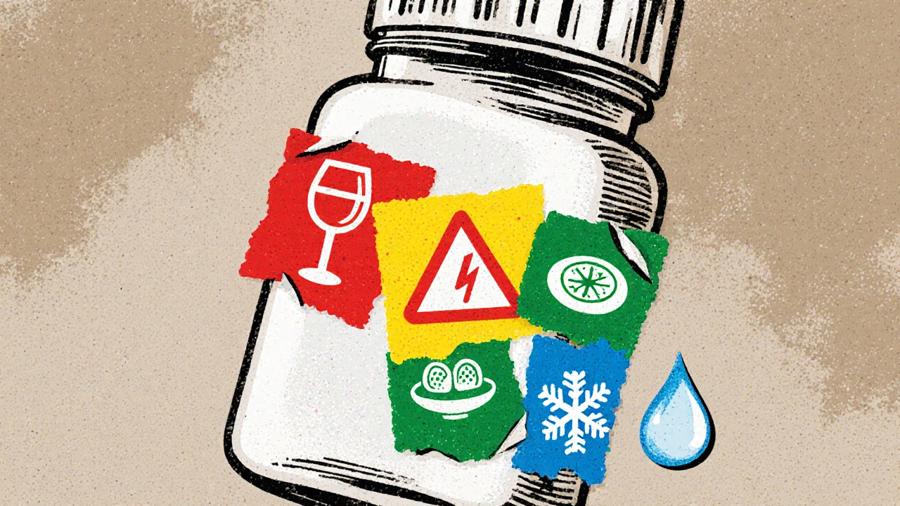
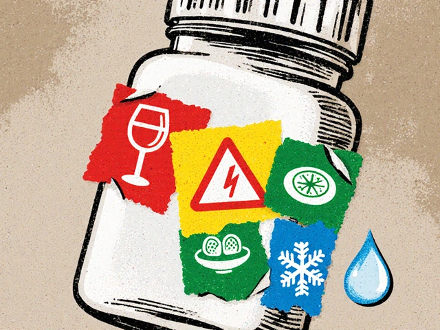
- Red - This is the alarm bell. Red labels mean something serious. Examples: "May Be Habit-Forming," "Do Not Take with Alcohol," or "May Cause Drowsiness." About 37% of all auxiliary labels are red. If you see red, pause. Read it twice.
- Yellow - This is the caution sign. Not life-threatening, but important. "Take on an Empty Stomach," "Avoid Sun Exposure," or "May Cause Dizziness." Yellow makes up 28% of labels. It’s the "be careful" signal.
- Green - This tells you how to take it. "Take with Food," "Take Once Daily," "Use Within 30 Days." Green is used in 22% of cases. It’s the practical guide.
- Blue - This is about storage. "Keep Refrigerated," "Store in a Cool, Dry Place," "Protect from Light." Blue covers 13% of labels. If your medicine needs cold storage, blue will tell you.
These colors aren’t just for show. A 2020 study by the American Society of Health-System Pharmacists found that 87% of patients instantly associate red with danger. That’s why it’s used for the most critical warnings.
What’s Written on the Labels
There are four main types of messages you’ll see on these stickers:
- Safety Warnings - These stop dangerous interactions. For example, 27% of antibiotic prescriptions include a label saying "Do Not Take with Alcohol." That’s because some antibiotics can cause severe nausea, vomiting, or even heart problems if mixed with alcohol.
- Usage Instructions - These tell you how to take the pill correctly. Nearly half of all NSAID prescriptions (like ibuprofen) say "Take with Food" to protect your stomach. But here’s a twist: a 2021 Johns Hopkins study found that 22% of patients misunderstood this. They thought "Take with Food" meant "take right after eating," when it really just means "don’t take on an empty stomach." That’s why clear wording matters.
- Storage Requirements - Some medicines break down if they get too hot or too cold. Biologics - like insulin or certain injectables - need refrigeration. About 18% of these drugs come with a blue "Keep Refrigerated" label. If you leave them on the counter, they can lose effectiveness.
- Adherence Reminders - These help you finish your course. For antibiotics, 68% of prescriptions include a label saying "Take Until Finished." This is critical. Stopping early because you feel better is one of the top reasons antibiotic resistance develops.
Placement Matters More Than You Think
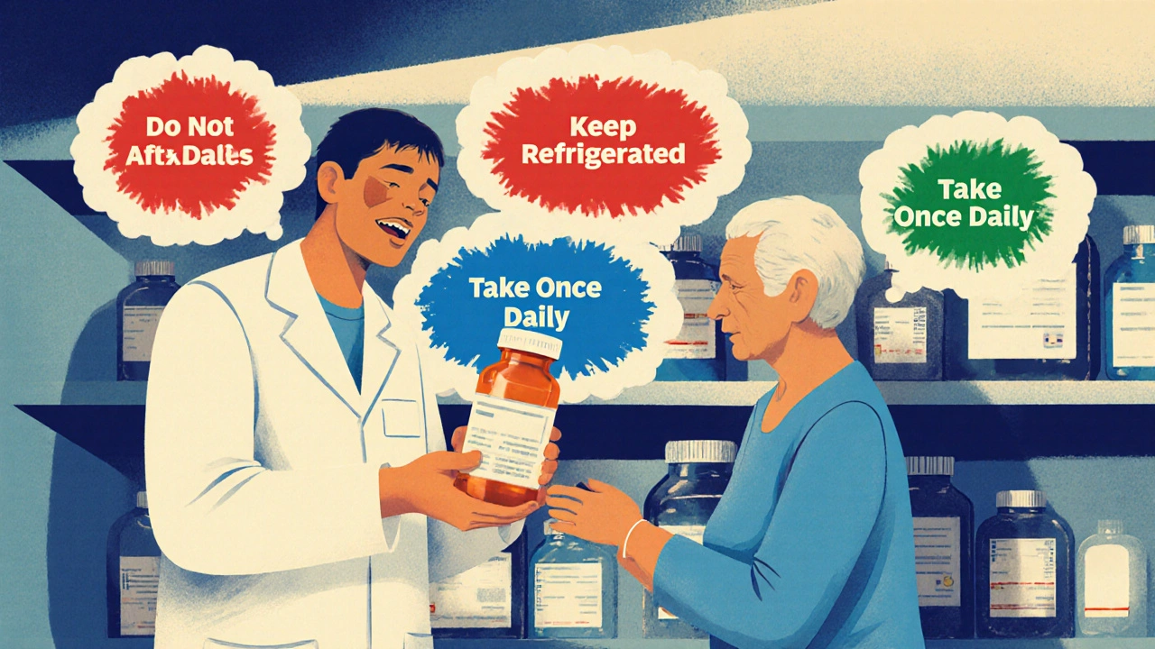
Where the sticker goes affects whether you’ll even see it. Most pharmacies still stick them vertically on the side of the bottle - that’s what 82% of prescriptions do. But here’s the problem: when you open the cap, your eyes go straight to the top. You don’t look at the side.
Research from the University of California showed that if you place the label horizontally - right on the cap or just below it - patients understand the message 31% better. Even better? Labels that require you to twist or lift the cap to see them (called "interactive placement") increase attention by 63%. That’s why some pharmacies now use flip-top labels or peel-back stickers.
And here’s something surprising: labels that include simple pictures - like a glass of water next to "Take with Food," or a snowflake for "Refrigerate" - improve understanding by 47% for people with low reading skills. That’s why many pharmacies are starting to add icons.
What’s Missing - And Why It’s Dangerous
Despite how common these labels are, many prescriptions still don’t have them. A 2016 study found that 15% to 25% of prescriptions at retail pharmacies had no auxiliary labels - even when the drug’s safety profile clearly required one. That’s not a mistake. It’s a system failure.
And it’s not just about missing labels. Sometimes, the labels conflict. One pharmacy might say "Take with Food," another might say "Take on an Empty Stomach" - for the same drug. That confuses patients. One study found 8% to 12% of auxiliary labels contained unclear or contradictory advice.
Language is another big gap. One in four Americans speaks a language other than English at home. But only 22% of pharmacies offer auxiliary labels in Spanish, Mandarin, Vietnamese, or other languages. That means thousands of people are trying to follow medical instructions they can’t fully read.
Are These Labels Required?
No federal agency forces pharmacies to use them. The FDA doesn’t approve or regulate auxiliary labels. But 48 out of 50 U.S. state pharmacy boards strongly recommend them. Thirty-nine states have made them part of official pharmacy practice rules.
California passed a law in 2024 (AB-1352) that now requires specific auxiliary labels for high-risk drugs like opioids, blood thinners, and seizure medications. The FDA also released draft guidance in September 2023 pushing for stronger opioid warning labels.
So while they’re not federally required, they’re legally expected in most places. Pharmacies that skip them risk liability if a patient is harmed.
What’s Changing - and What’s Coming
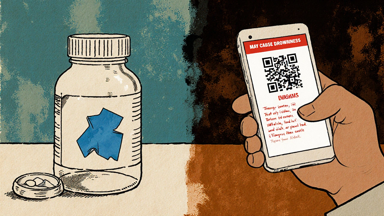
Technology is starting to blend with these little stickers. Some chain pharmacies are testing QR codes on labels. Scan it, and you get a short video from a pharmacist explaining how to take the drug. Others are trying smart labels with temperature-sensitive ink - they change color if your insulin got too warm during transport.
By 2025, 62% of major pharmacy chains plan to offer digital versions of these labels through their apps. But here’s the catch: federal rules still require every prescription container to have visible, permanent safety information. That means physical labels aren’t going away. They’re just getting help from tech.
What You Should Do
Don’t ignore those stickers. Read them every time you get a new prescription - even if you’ve taken the same drug before. Warnings can change. Dosages can change. Storage rules can change.
If you don’t understand a label, ask. Don’t assume. Say: "Can you explain what this sticker means?" Pharmacists are trained to help with this. They see hundreds of these labels every day.
If you think a label is missing, wrong, or unclear, speak up. Tell the pharmacist. If they brush you off, ask to speak to the pharmacist-in-charge. Your safety isn’t optional.
And if you’re helping someone else - an elderly parent, a child, a friend - make sure they see the labels too. Sometimes, the person taking the medicine doesn’t pick it up. The person who does might not know what the stickers mean. Make it part of your routine to check.
These tiny stickers save lives. They prevent ER visits. They cut healthcare costs by over $1.3 billion a year. They’re not just paper and ink. They’re your last line of defense against a dangerous mistake.
How to Spot a Problem Label
Here’s a quick checklist the next time you get your prescription:
- Is there a red label for serious warnings? (Alcohol, drowsiness, habit-forming)
- Is there a green label telling you how to take it? (With food? Once a day?)
- Is there a blue label for storage? (Refrigerate? Keep away from light?)
- Are there more than three labels? Too many can cause confusion.
- Is the text clear? Or is it faded, smudged, or handwritten?
- Do you understand every word? If not, ask.
If you answer "no" to any of these, don’t leave the pharmacy without getting it fixed.


Pallab Dasgupta
Man, I never realized these little stickers were doing heavy lifting like this. In India, we don’t even get them half the time - pharmacists just hand you the bottle and say 'take it' like it’s a candy. This post opened my eyes. These aren’t decorations, they’re lifelines.